
Designing for Concrete: My Mile High Sidewalks Stamp
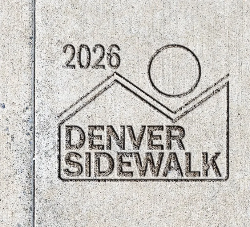
This summer the City of Denver ran a Sidewalk Stamp Contest, asking residents to design the mark that gets pressed into new sidewalks. I could not pass it up. From 2012 to 2016 I ran Boutique Concrete, a concrete fabrication studio in Los Angeles, so this was two of my worlds meeting.
My design was not selected to move forward. I still like it, and the process taught me enough that it is worth writing down.
Starting from the flag. Denver already has a strong set of symbols in its city flag, so I did not try to invent new ones. The zigzag form echoes the flag's white peak, a nod to the Rocky Mountains and the Mile High identity. The circle stands in for the flag's yellow sun disc, simplified to one clean shape so it still reads after years of wear.
Line instead of color. The flag uses color to separate sky, mountains and sun. A stamp has no color. It has depth, shadow and whatever grit settles into the grooves. So the stamp does the same work with line weight and negative space. The peak and the circle are bold, consistent strokes, built to hold up structurally. No thin details that break down under repeated wear. No fine gradients that concrete cannot reproduce.
Type you can read while walking. "DENVER SIDEWALK" anchors the bottom in a heavy, condensed typeface. People glance down for a second while they walk. The words have to land in that second.
A date in the corner. The year sits in the upper left, inside the contest's 8 by 7 inch landscape format. That lets each stamp double as a record of when the sidewalk was poured, the way the small contractor stamps all over the city already do. I have always liked those. They are some of the only signatures left on public infrastructure.
What designing for concrete taught me:
Draw at actual size early. At 8 by 7 inches, anything delicate is gone the first winter.
Shadow is your only color. The mark changes all day as the light moves. Strong shapes survive that. Subtle ones disappear.
Borrow symbols people already own. A resident should recognize the stamp as Denver before they read a word.
In the end I came to see the sidewalk as civic ground. Residents cross it every day without much notice. A good stamp quietly carries a piece of the city's identity underfoot, and it might outlast all of us.
Not being selected stings a little. It also leaves me with a finished concept, a clearer sense of how to design for material instead of screens, and a reason to keep looking down when I walk.
