うたかた / Ephemeral: Making a Photo Book From a Week of 35mm Film
I brought a 35mm camera to Japan and not much of a plan. A week in Niseko and Tokyo, a few rolls of film, and the knowledge that I would not see any of it until I got home. That delay ended up shaping the whole book.
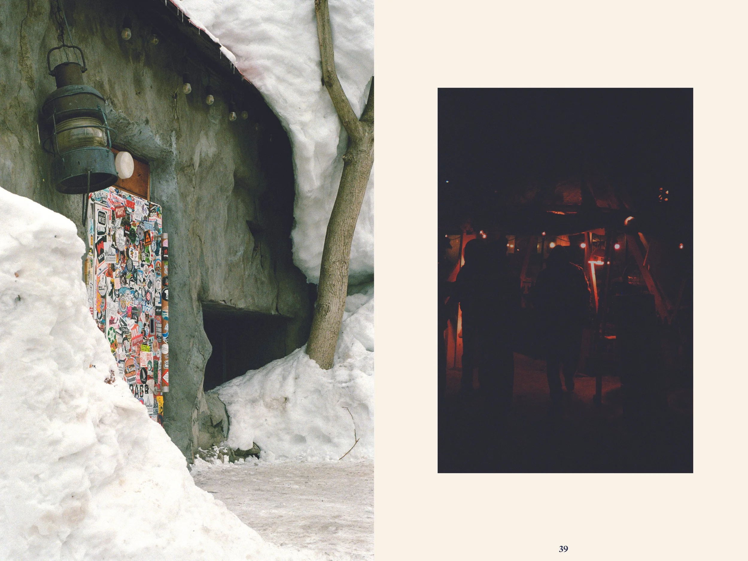
Film makes you choose. You cannot shoot two hundred frames of the same lift line and sort it out later. Each frame costs something, so you wait. When the scans came back, the pictures were not the trip I remembered. They were quieter. Snow on a rooftop. A wet street at night. A bowl left on a counter. That is what the book became about.
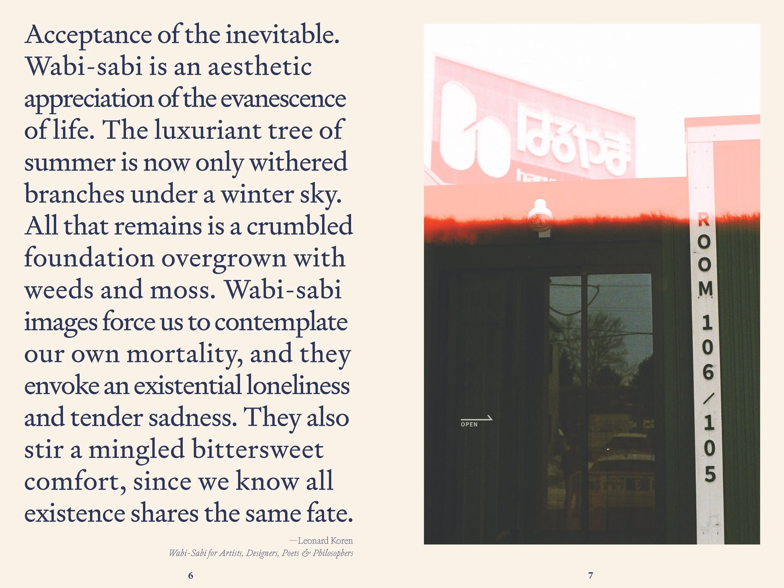
The idea. Before the trip I read Leonard Koren's Wabi-Sabi for Artists, Designers, Poets & Philosophers. It is a short book about beauty that is imperfect, impermanent and incomplete. I did not think much about it while I was shooting. Then I developed the film, and the connection was obvious. The pictures already had that quality. Wabi-sabi became the concept that drives the whole book, both the design and the narrative. Nothing is over-polished. Imperfect frames stay in when they feel true.
The title. うたかた (utakata) means the foam that forms on moving water and disappears. It comes from the opening of the Hōjōki, Kamo no Chōmei's 800 year old essay about impermanence. The book opens with that passage in Japanese alongside Donald Keene's English translation, and a second epigraph from Leonard Koren's Wabi-Sabi for Artists, Designers, Poets & Philosophers.
The type. I started with Source Han Sans and moved away from it. Signifier from Klim Type Foundry sets the Latin text. It has a little warmth in it, which a neutral sans did not. For the Japanese I am still searching for the right face from a small studio, one that matches Signifier's character and fits a small-press budget.
The palette. Raw Linen and Deep Indigo. Indigo because it is everywhere in Japanese textiles. Linen because it looks like paper that has been handled.
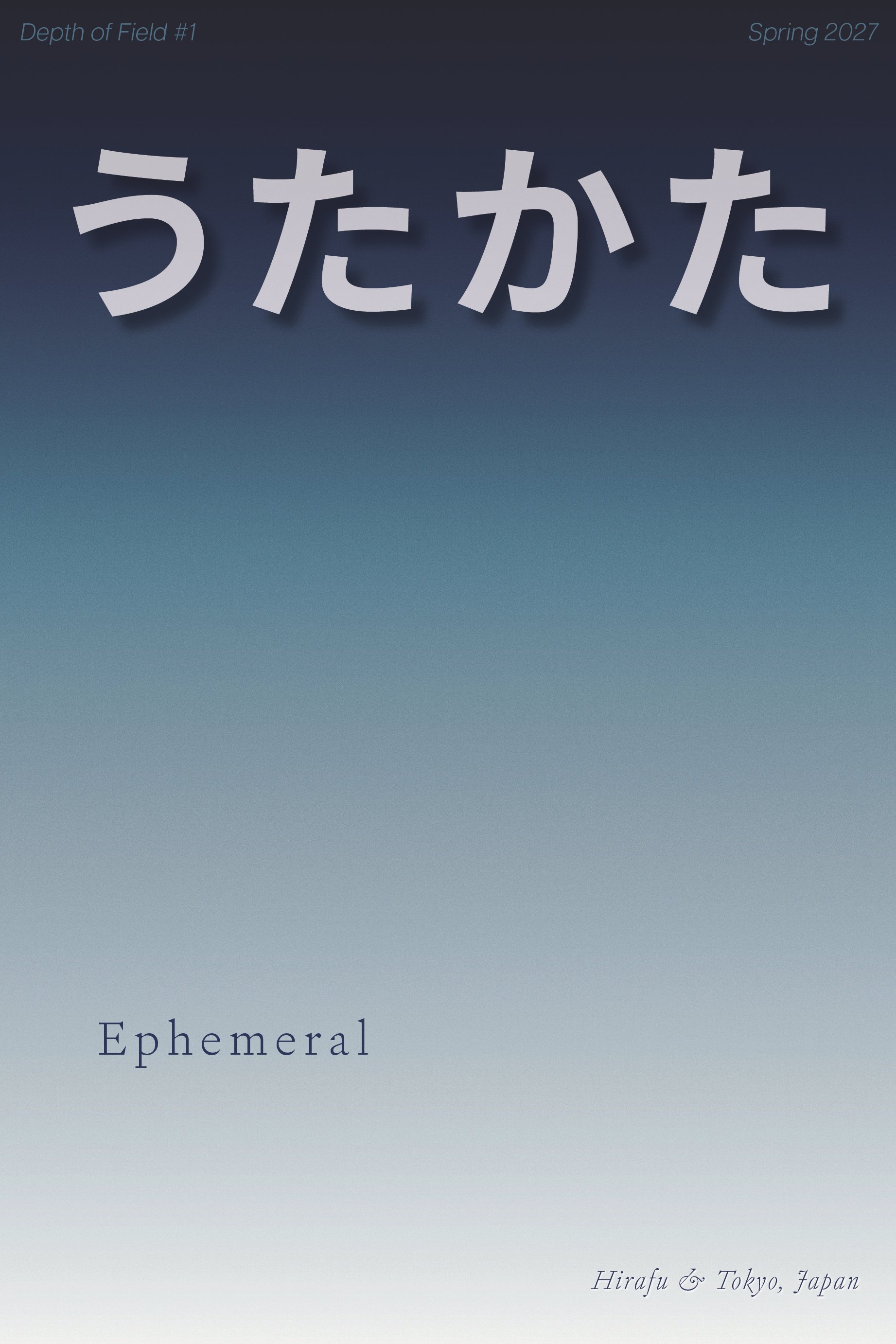
The cover. The cover uses a Japanese gradient from Nuevo.Tokyo, a reductionist design studio that built a library of gradients from traditional Japanese colors. It moves from near-black at the top, through deep indigo and a cold steel blue, down to a soft linen white, with a fine grain over all of it. It is the book's two colors, Deep Indigo and Raw Linen, joined into one surface. To me it looks like the Hokkaido sky just before first light, over snow. A gradient felt right for a book about impermanence. It has no hard edge. One color is always in the middle of becoming the next.
The writing. Seven short chapters, written slowly. I tried to describe what I saw without explaining what it meant.
Ephemeral is the first volume of a series I am calling Depth of Field. Each volume is one place and one idea. Mexico City is next, about color. Norway follows, about spirituality and architecture. I plan to print each in a small run of about 500 copies.
The biggest lesson so far: editing a photo book is mostly removing pictures you love. The ones that stay are the ones that can sit quietly next to each other.