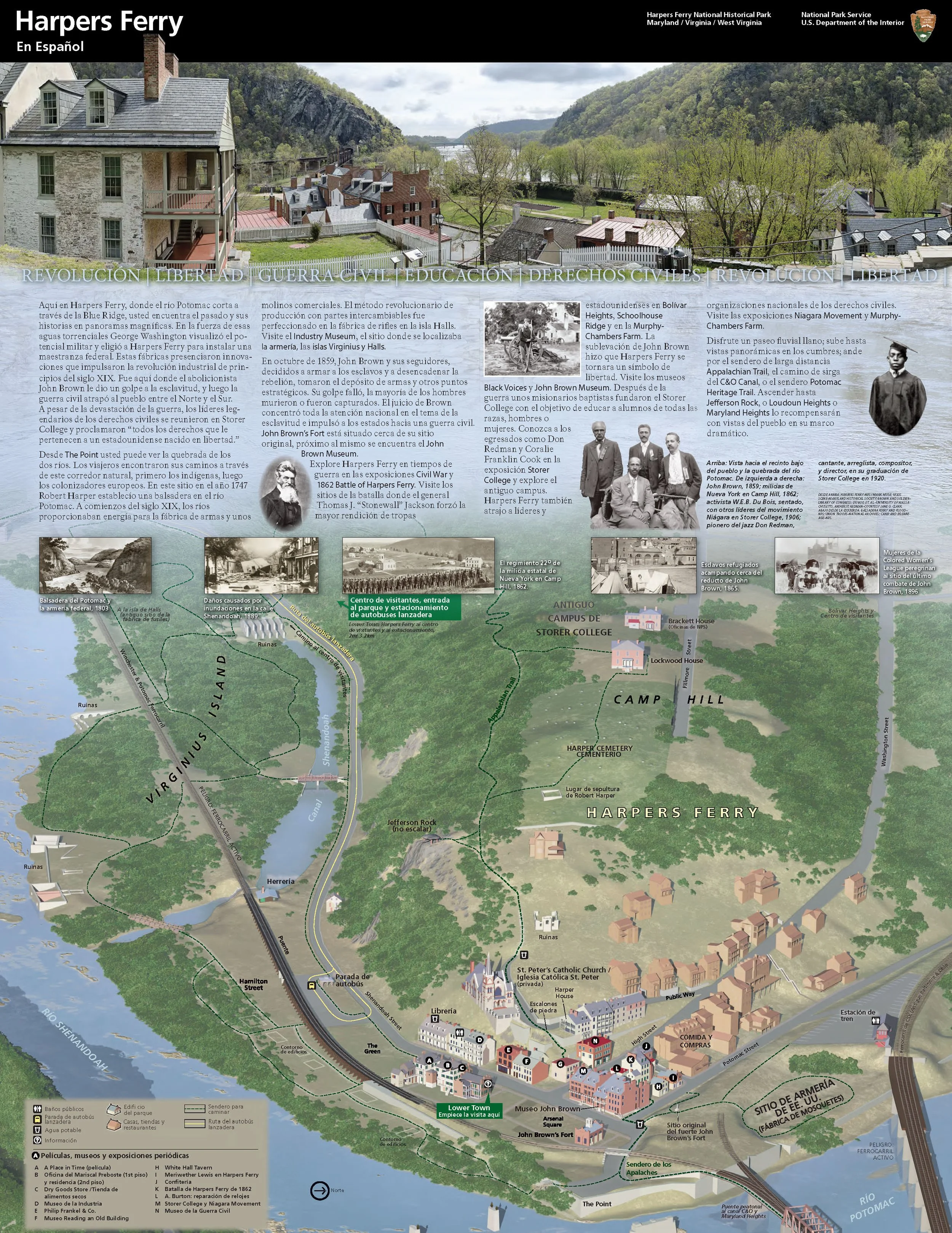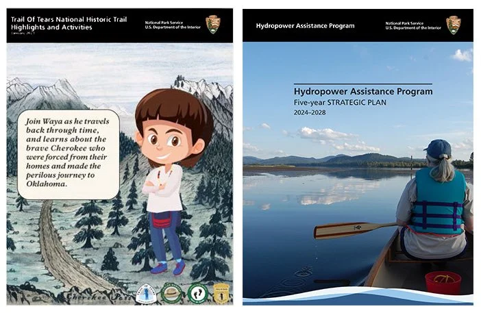
If you have visited a national park, you have held one. A folded brochure with a black band across the top, the park name in clean white type, a big photo and a map on the back. That is the Unigrid, designed by Massimo Vignelli in 1977 for the National Park Service under publications chief Vincent Gleason.
The system is modest on paper. A basic panel of about 4 by 8¼ inches. Formats one or two panels wide and up to six panels long, sized to get the most out of a standard press sheet. A black band, a fixed title treatment and standard typography. The NPS arrowhead joined the band in 1999. It won a Presidential Design Award in 1985, and the Harpers Ferry Center still prints around 20 million of them a year.
I think about it constantly in my own work. Much of my career has been communications for federal agencies: the Federal Highway Administration, USDOT, the Turner-Fairbank Highway Research Center and the National Park Service. The audience is everyone. A researcher, a city engineer, a fourth grader. The budget is public money. The work has to last.
The Unigrid solves that by making the routine decisions once. Size, fold, title, type. Every park does not need to reinvent the brochure. That frees the designers on each project to spend their time on what is specific: the map, the photography, the story of that place.
Three principles I have borrowed from it:
Standardize the frame, not the content. A strong system should make every piece look related while letting each one say something different.
Design for the press sheet and the budget. Constraints are not the enemy. Vignelli sized the panels to waste less paper.
Respect the reader's time. A visitor at a trailhead needs to find where they are in seconds.
I used that thinking on the NPS Junior Rangers Story Map, where we built characters, illustrated playing cards and custom maps for grades K through 5. The Trail of Tears component was developed in coordination with Tribal council to make sure the language and imagery were right. A consistent system made room for that kind of care, because we were not reinventing the basics each time.
Good public design is often invisible. Nobody thanks the brochure. That is usually a sign it worked.