Respect for the Letter: How to Create Typefaces: From Sketch to Screen
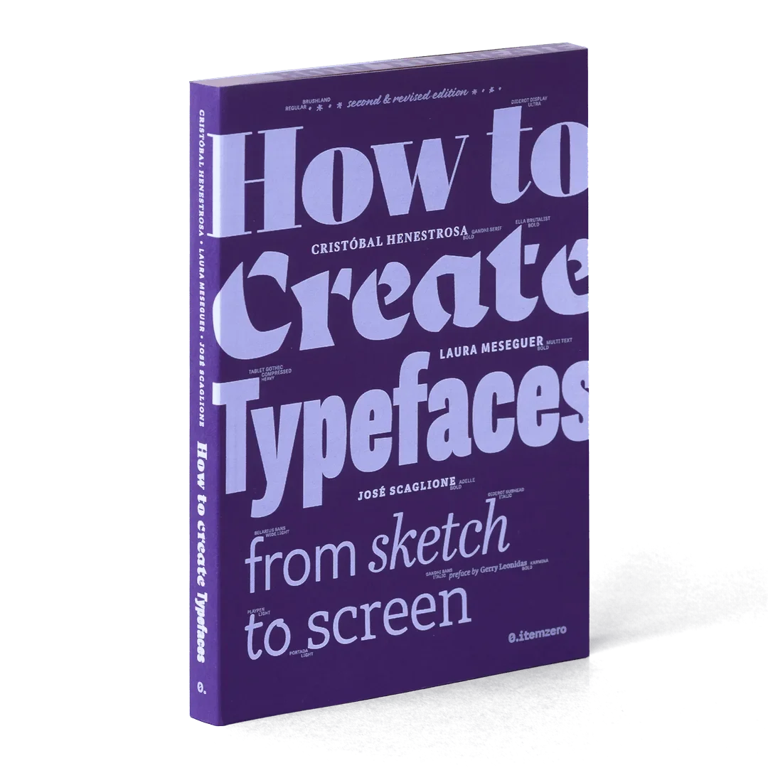
I have chosen typefaces for clients for more than fifteen years. I had never seriously tried to draw one. How to Create Typefaces: From Sketch to Screen changed that, or at least got me started.
The book is written by three working type designers: José Scaglione, co-founder of TypeTogether, along with Cristóbal Henestrosa and Laura Meseguer. It first came out in Spanish from Tipo e, a small Madrid publisher, and the English edition, translated by Christopher Burke and Patricia Córdoba, launched in 2017.
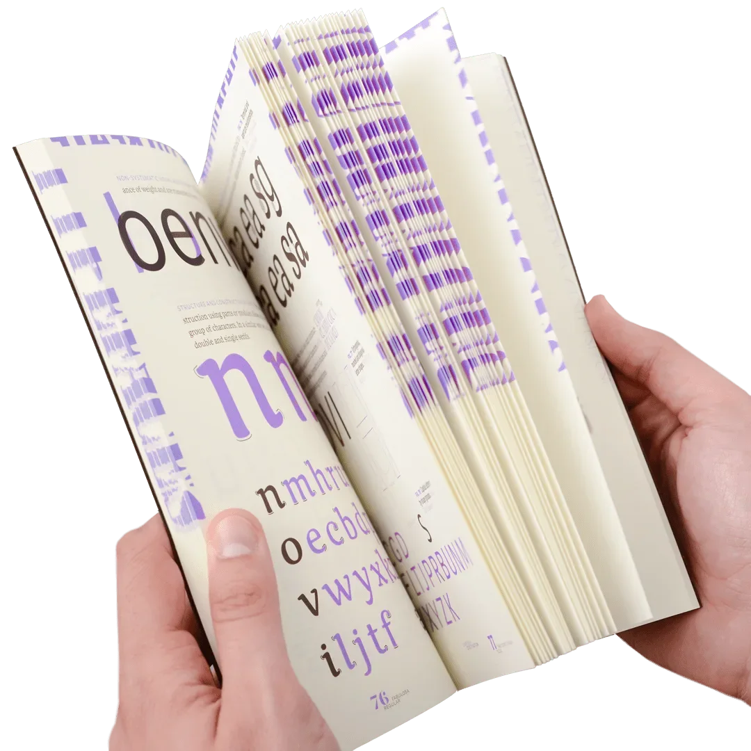
It does what the title says. You start with the idea behind a typeface and the sketch, then move through proportion and structure, digitizing, spacing and kerning, building out a family with weights and italics, and finally the legal side and distribution. The Alphabettes review called it a book that fills a gap for beginners, and that matches my experience. It is clear without being thin.
The chapters on spacing were the ones that got me. Every designer knows bad spacing when they see it. Fewer of us know why it happens. The book shows that the space inside and around letters is drawn just as carefully as the letters themselves. After reading it I went back through a few recent layouts and saw tracking decisions I would make differently now.
The authors are upfront about scope. The focus is Latin serifs and sans serifs. OpenType programming, hinting and non-Latin scripts get light treatment. That honesty is useful. It tells you where to go next instead of pretending to be everything.
Why this matters for a graphic designer who is not planning to run a foundry:
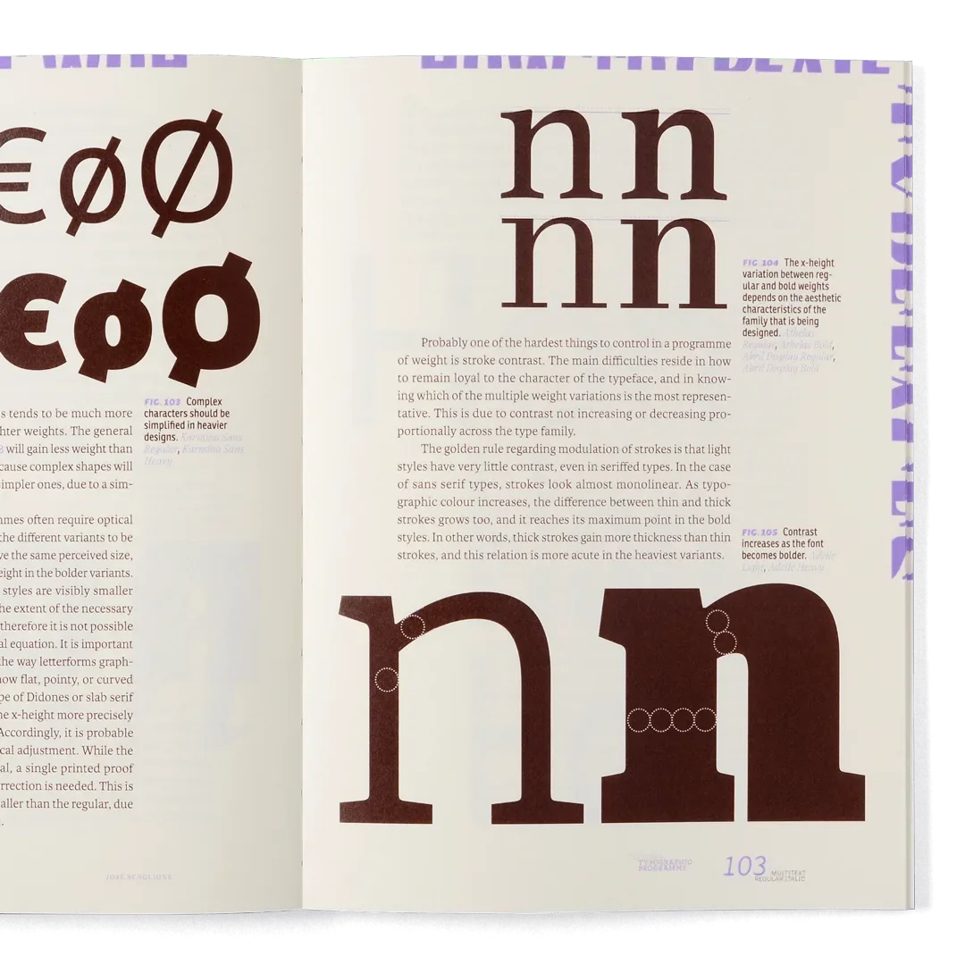
You pick better type when you know how it is made. Contrast, x-height and spacing stop being taste and start being reasons.
You respect the license. The chapter on legal issues is a good reminder that fonts are someone's work.
Small foundries deserve the attention. For my Japan photo book I paired Signifier from Klim with TP Sky from Type Project, a small Tokyo foundry. Reading this made me appreciate how much labor sits behind each of those files.
I am working on a display alphabet based on Colorado signage and will share sketches here as it develops.