Still on the Desk: Grid Systems in Graphic Design, Revisited
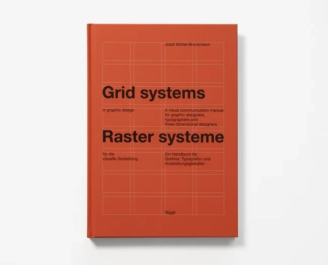
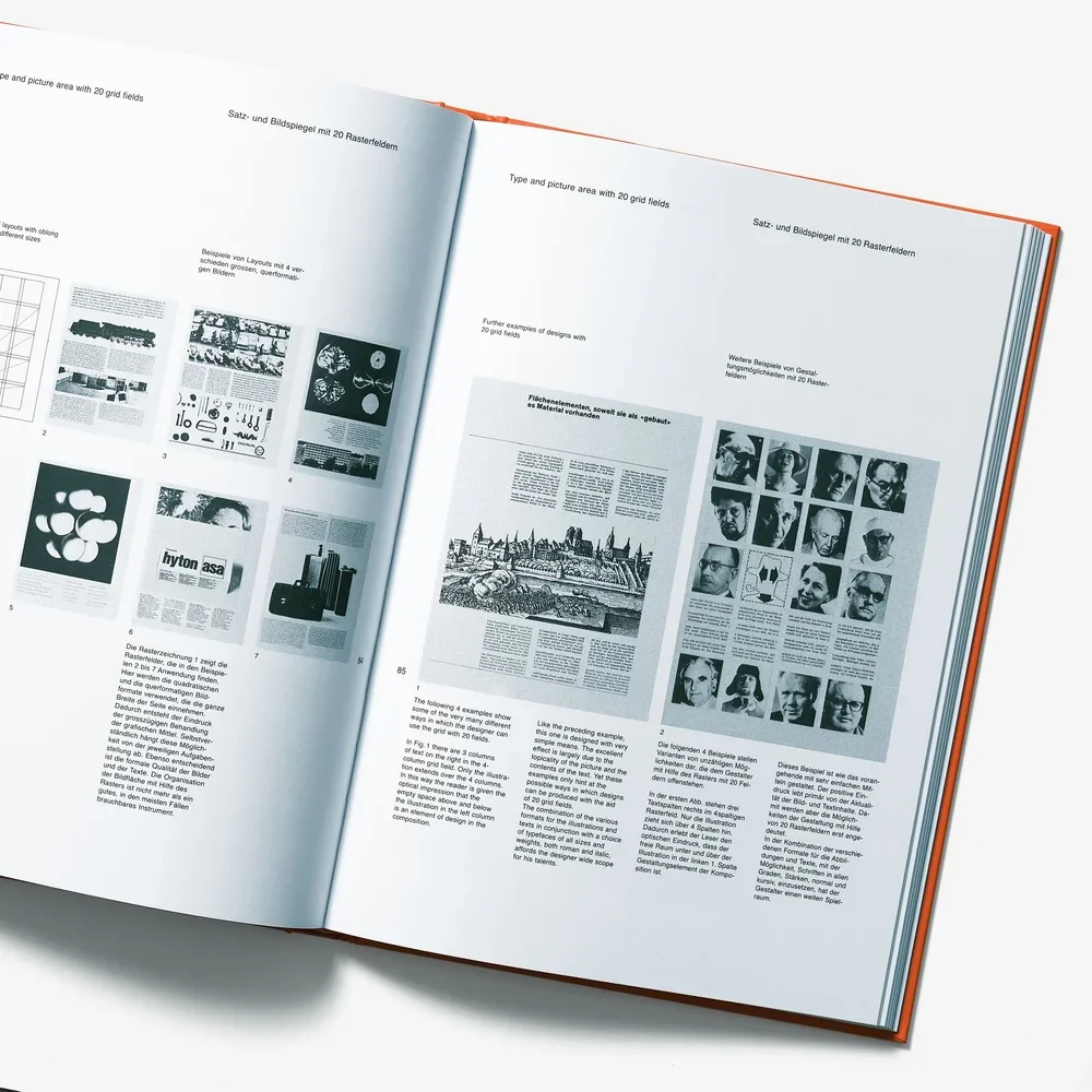
Every design student meets Grid Systems in Graphic Design at some point. Josef Müller-Brockmann published it in 1981 through Niggli in Switzerland. It is a bilingual German and English hardcover, 176 pages, with 357 illustrations and step-by-step instructions for grids from 8 to 32 fields.
In school at Otis I read it as a rulebook. Columns, gutters, baselines, do this, not that. It felt strict. Reading it again now, I see something else in it.
Müller-Brockmann is not really selling rules. He is selling a way of working that removes noise so the content can speak. The grid is there so you can make decisions faster and more consistently, then spend your energy on what actually matters. That is almost exactly how I think about brand systems for clients today.
After reading Reinfurt's A New Program for Graphic Design this fall, the two books feel like a conversation. Reinfurt treats design as a liberal art, open and curious. Müller-Brockmann treats it as a discipline, ordered and exact. You need both. Curiosity without order makes a mess. Order without curiosity makes something dull.
Where the grid still earns its keep in my practice:
Multi-page documents. Federal reports, case studies and books. A good grid lets a 60 page report feel like one object.
Systems that other people will use. A brand handed to an in-house team needs structure they can follow without me in the room.
Photo sequencing. In my photo book, a simple grid keeps attention on the images instead of the layout.
Where I break it on purpose: posters, bar menus and anything that should feel handmade. Knowing the grid well is what makes breaking it look intentional rather than sloppy.
If you only know this book from a slide in a lecture, buy it. It is expensive and worth it. It rewards being read slowly, a few pages at a time.